Grill & Go - Mobile app
Role: Lead UX Designer | UX Research | Interaction & Visual Designer
Designed a mobile app for a BBQ restaurant that allows users to reserve a table, place orders, and pay seamlessly from their phone, with a strong focus on accessibility and ease of use.
The Challenge
During early discovery, I identified a critical gap: many users struggle to order independently due to accessibility limitations, language barriers, and complex ordering systems. These issues create frustration, increase dependency on staff, and slow down the dining experience.
The opportunity was clear:
How might I design an inclusive ordering experience that allows any user — regardless of ability, language, or tech confidence — to order and pay independently, quickly, and confidently?
The vision
Create a fully accessible, simple, and intuitive mobile ordering experience that:
Removes communication barriers
Supports accessibility needs from the start
Reduces waiting time and friction
Enables independent ordering and payment
Works for all ages, abilities, and tech levels
Ordering food in restaurants seems simple — until barriers appear.
User Interviews
For my research I conducted 4 in-depth user interview using open-ended questions to:
To understand curent experience users havind when dining out
To identify friction points across waiting, ordering, and checkout moments
To uncover accessibility challenges
To identify the opportunities to improve both user experience and operational efficiency
Insights
Research Process

Competitive audit
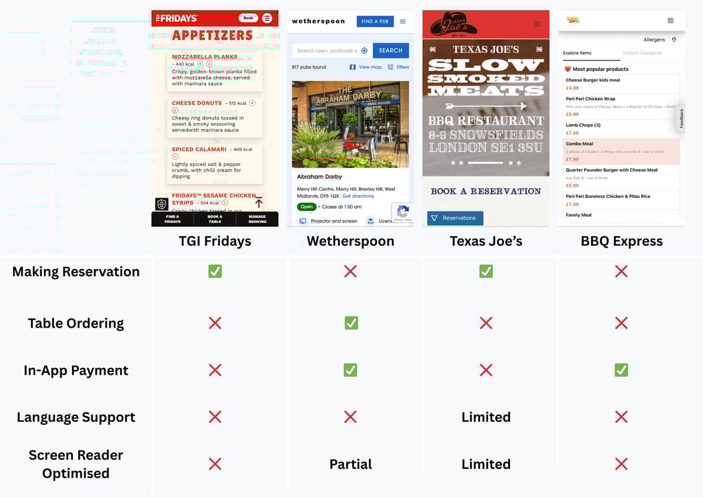
In order to understand the curent market and to identify systemic gaps that are preventing users from ordering independently (particularly those with accessibility needs or language barriers), I've conducted a competitive audit on four different restaurants
My evaluation criteria included:
Table-side ordering & payment
Accessibility (screen reader optimisation, alt text)
Language flexibility
Reservation management
Simplicity of checkout
Insights
Some competitors offer strong functionality while others excel in brand experience, however none fully integrate:
Reservation, ordering, and payment into a unified flow
Accessibility-first design as a visible priority
Audio-enabled support beyond default device tools
Prominent language-switching functionality
Summary
Many restaurants lack digital ordering and payment options, creating frustration and dependency for vulnerable users, including non-native English speakers and visually impaired users.
Even where digital menus exist, complex flows or missing accessibility features often limit usability.
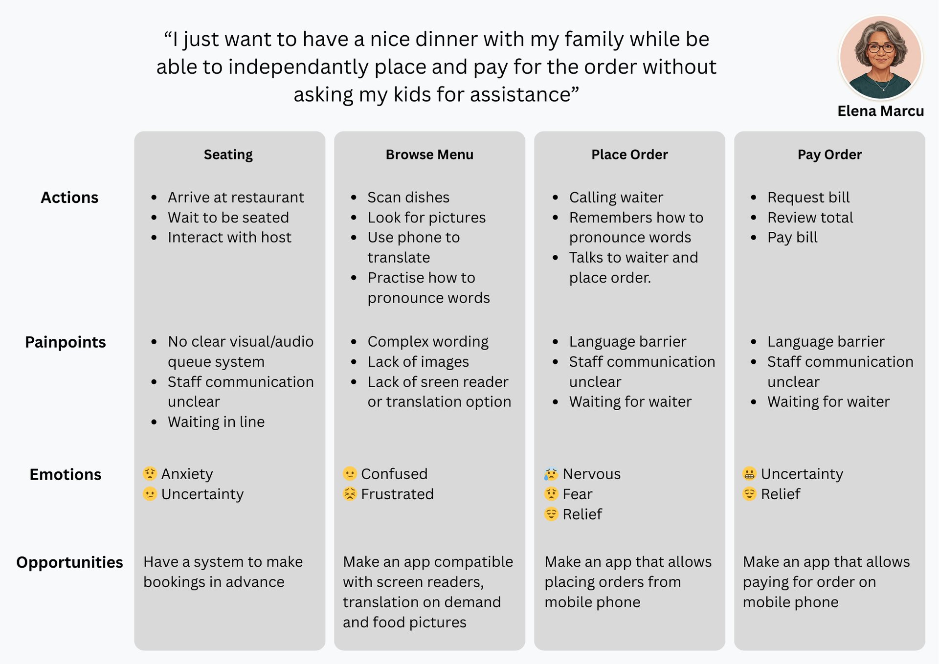
To understand user behaviors, motivations, and frustrations, I created detailed user personas, mapping out user journeys, and identifying key pain points. This provides a clear foundation for designing solutions that address real user needs.
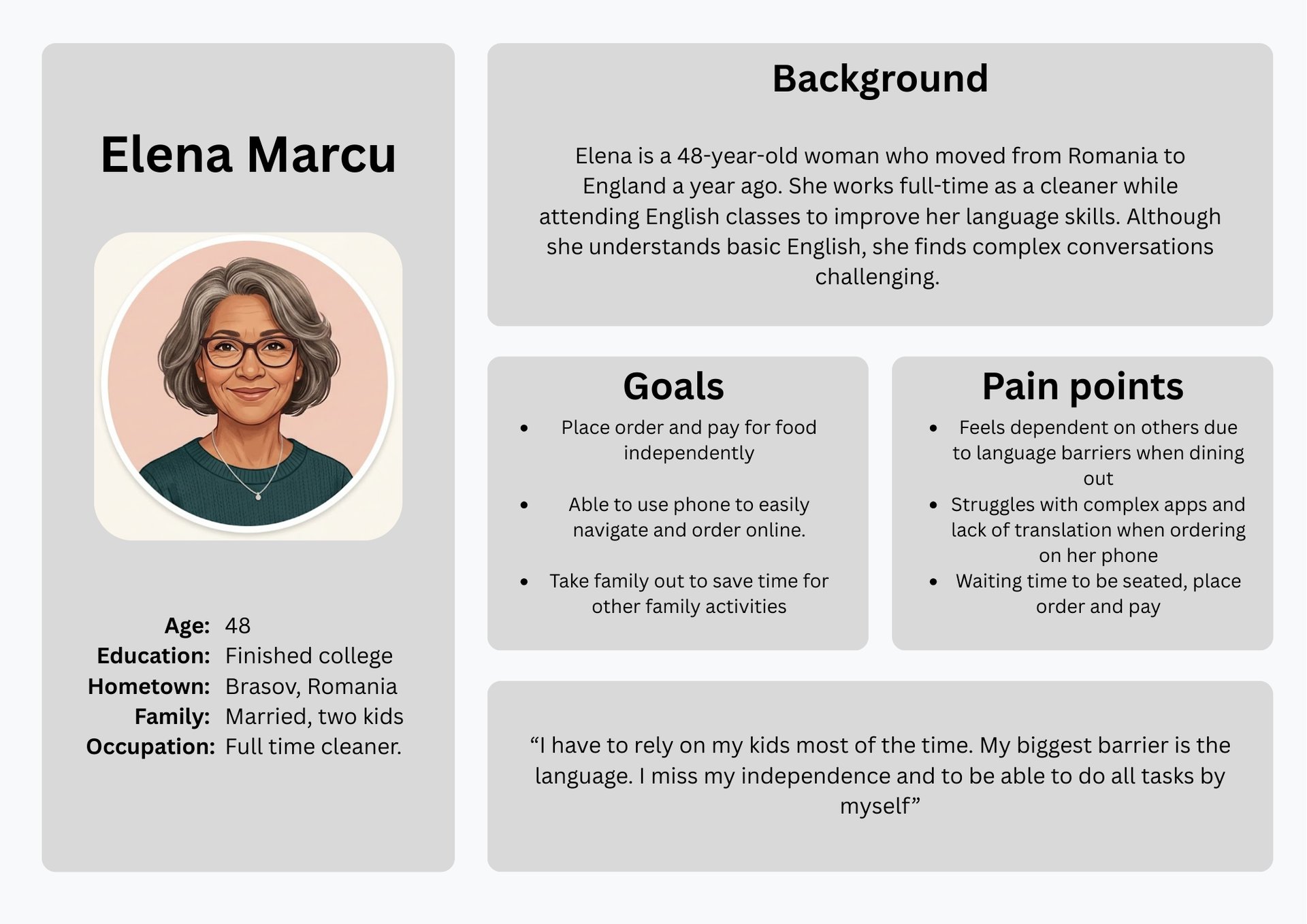

Painpoints
Lack of accessibility features on existing restaurant apps
Language barrier
Overly complex checkout points
Missing dietary and nutritional information
Queue uncertainty and waiting delays
Staff dependency across ordering and payment
Synthesis
Ideation
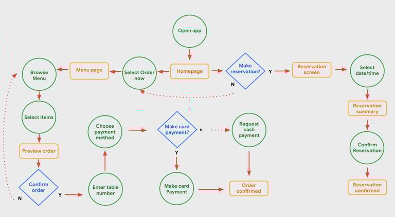
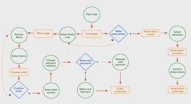
User flow diagram - helped me identify key decision points users will have to make in order to complete their task, so that I can remove potential friction throughout the experience
These findings directly informed the design direction outlined in the Solution below, ensuring that accessibility and simplicity were foundational rather than surface-level enhancements.
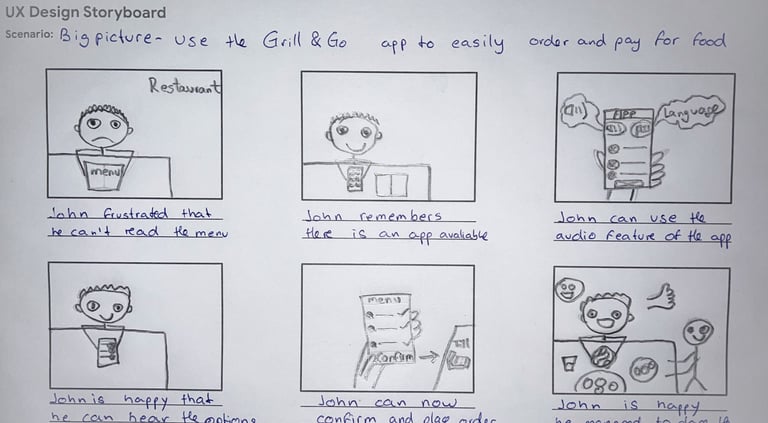
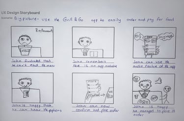
Storyboard - to bring the journey to life and help me visualise how users would interact with the app in a real dining context.
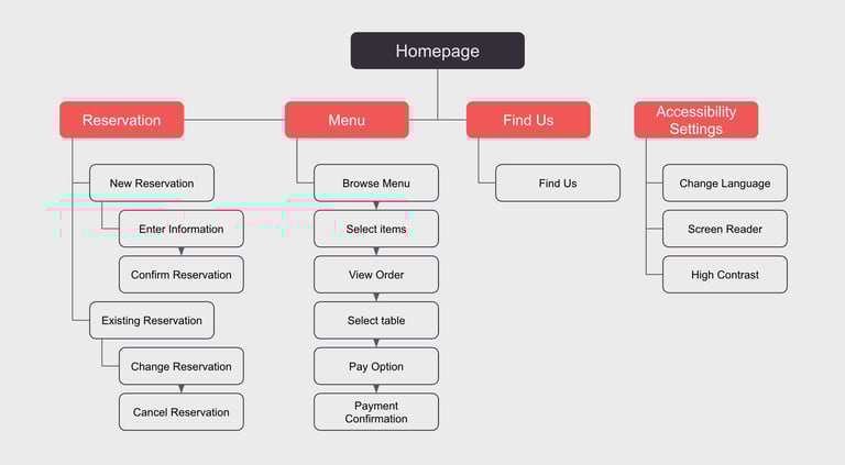
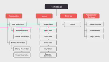
Information architecture - define a clear, intuitive structure — ensuring the foundation of the app prioritised simplicity, accessibility, and confident navigation from the very start.
With clear insights from research and synthesis, I moved into ideation to translate user needs into tangible design direction.
Solution

Lo-fi Wireframe
After defining the user flow and interaction structure, I created low-fidelity wireframes and built a simple interactive prototype to validate the core experience before investing time in visual design.
The purpose of this prototype was to:
Test the overall user flow
Evaluate whether key tasks could be completed intuitively
Identify usability issues early in the design process
By focusing on structure and interaction rather than visual details, this stage allowed for quick iteration and meaningful feedback during usability testing.
Usability Study Round 1
To validate whether users understood the core interactions and could complete key tasks without confusion, I conducted moderated usability testing focused on three core task completion:
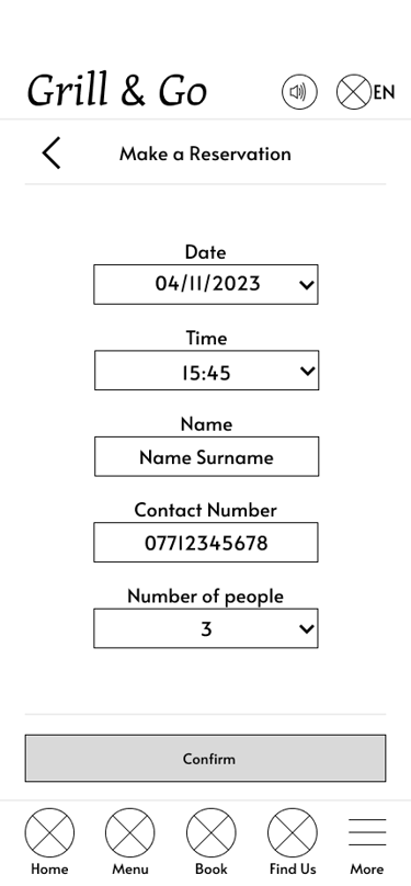
Make a reservation
Browse the menu and add items to basket
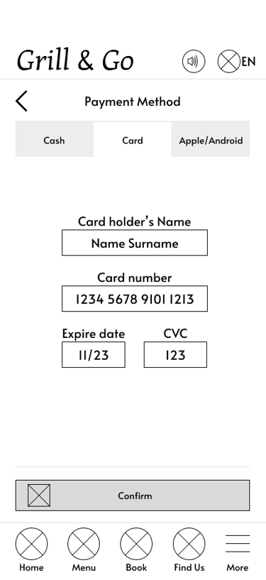
Confirm and pay for the order
This allowed usability issues to be identified early, reducing the risk of carrying design problems into later stages of the design process.
What was discovered

Task Completion rate
The usability study revealed that while users found the booking process intuitive, some struggled with menu interactions and identifying key actions such as adding items to the basket and selecting payment methods. These insights guided several design improvements, which were implemented in the high-fidelity prototype shown below.

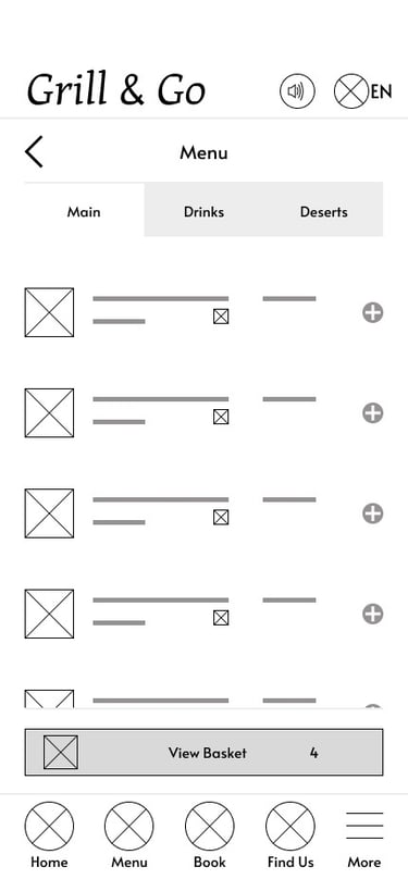


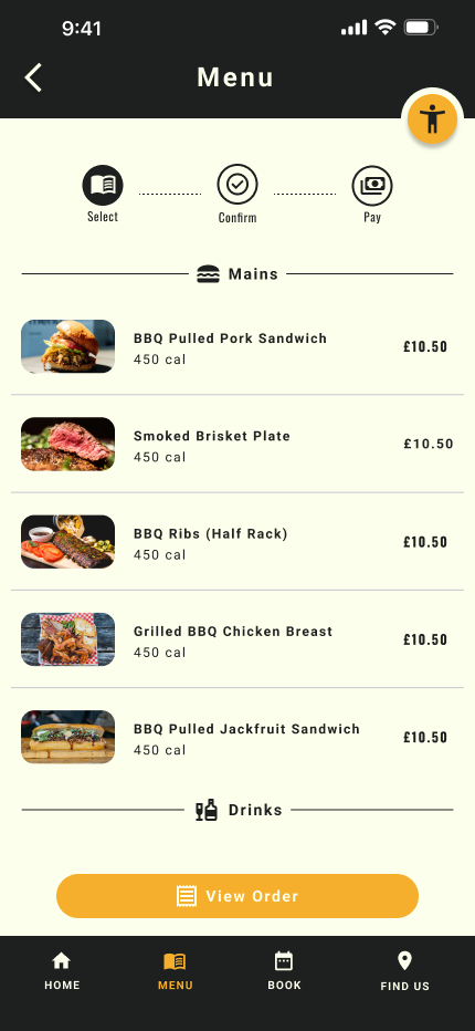
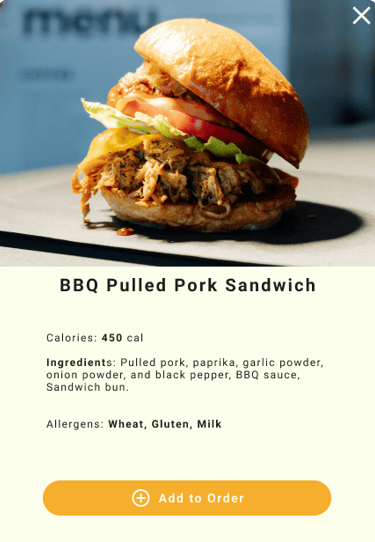
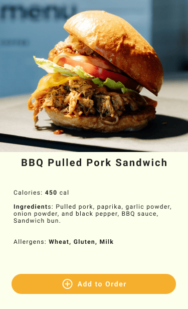
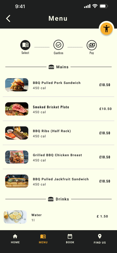
Adding Items to Basket
To address the issue users were having with the add to basket buttons - I've redesigned the menu by introducing individual dish cards. This also addresses the issues of missing dietary information.
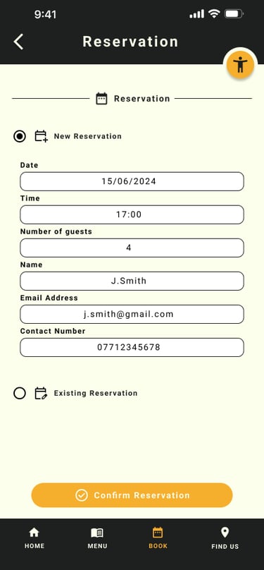
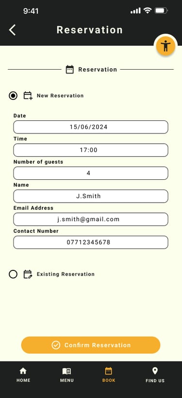
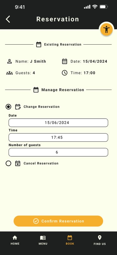
Reservation Page
Redesign the reservation section to enable users not only to where users can make a new reservation, ammend or cancel an existing one - This give users a more convenient way of managin the reservation which will reduce further frustration should they need to change date or cancell.
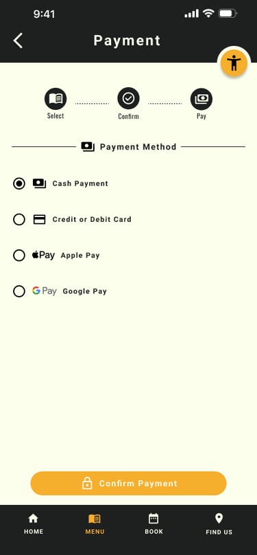
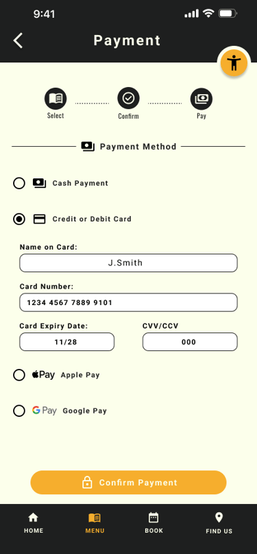
Choosing Payment Methods
To address the issue where users were missing the different payment methids - I've lowered the payment options buttons and increase the size for better visibility
Hi-Fi Prototype
After making key design iterations based on insights from the usability study, I moved into developing the high-fidelity prototype. This stage focused on refining the experience by strengthening visual hierarchy, improving accessibility, and streamlining the overall user flow into a more intuitive and polished solution.


Before
After
Before
After
Before
After
Validation
I've conducted validation testing on the hi-fi prototype to test how effective the design decisions were. Below is a summary of the finding
Impact
After usability validation:
100% task completion rate
Users described the app as simple, intuitive, and easy to use
All participants were able to order and pay independently
Reduced confusion and navigation errors
Increased confidence for non-tech-savvy users
Behavioural Outcomes
Faster decision making (visual menu + nutrition info)
Reduced dependency on staff
Lower cognitive load during checkout
Improved accessibility confidence
Key Learning
Accessibility must be foundational, not added later
Iteration dramatically improves usability
Simplicity beats feature overload
Diverse testing leads to stronger solutions
Clear language is critical for usability
Next Steps
Expand usability testing across broader demographics
Further optimise for low-tech users
Introduce smart recommendations / repeat orders
Develop responsive web experience
Enhance accessibility automation
Let's Connect
If you’d like to collaborate or learn more:
Email: alstcouk@gmail.com
Phone: 07714 309280
LinkedIn: linkedin.com/in/alin-stanciu