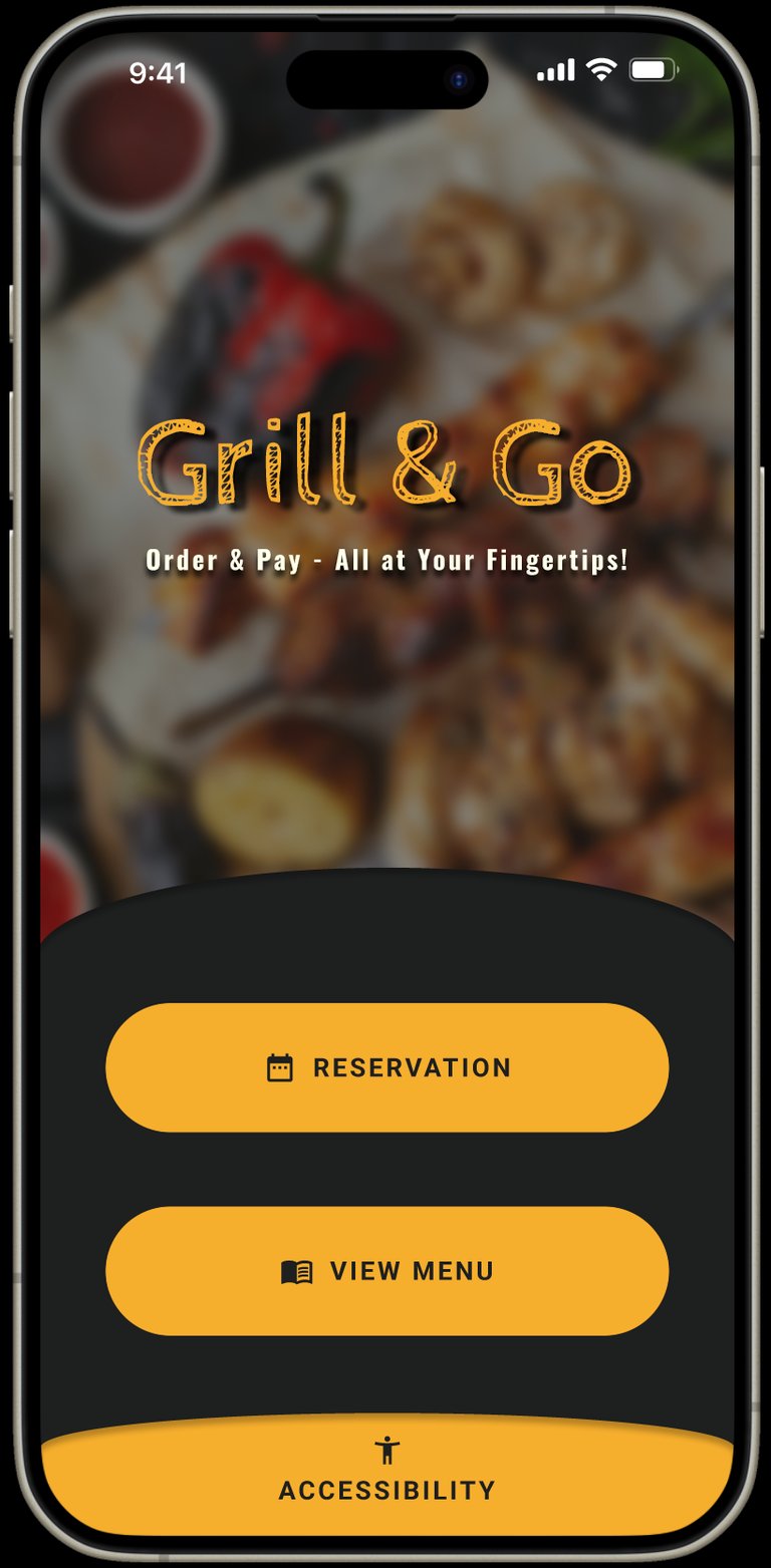
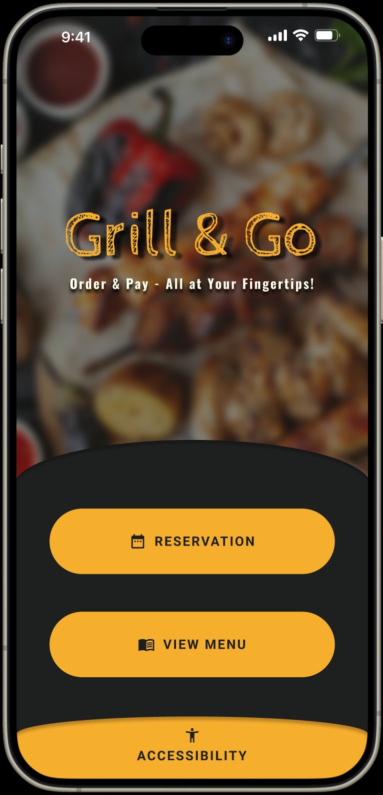
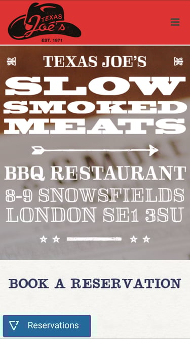
Grill & Go - Mobile app
Role: Lead UX Designer, UX Researcher, Interaction & Visual Designer
Menu and payment app for a BBQ Restaurant
The Challenge
Ordering food in restaurants seems simple — until barriers appear.
During early discovery, I identified a critical gap: many users struggle to order independently due to accessibility limitations, language barriers, and complex ordering systems. These issues create frustration, increase dependency on staff, and slow down the dining experience.
The vision
Create a fully accessible, simple, and intuitive mobile ordering experience that:
Removes communication barriers
Supports accessibility needs from the start
Reduces waiting time and friction
Enables independent ordering and payment
Works for all ages, abilities, and tech levels
The opportunity was clear:
How might I design an inclusive ordering experience that allows any user — regardless of ability, language, or tech confidence — to order and pay independently, quickly, and confidently?
Research Approach
For my research I conducted 4 in-depth user interviews using open-ended questions to uncover real frustrations and behaviours when ordering at restaurants.
Insight
Results matched my assumptions - Users are willing and often prefer — to use mobile ordering only if it is simple, fast, and accessible.
Pain Points
Personas
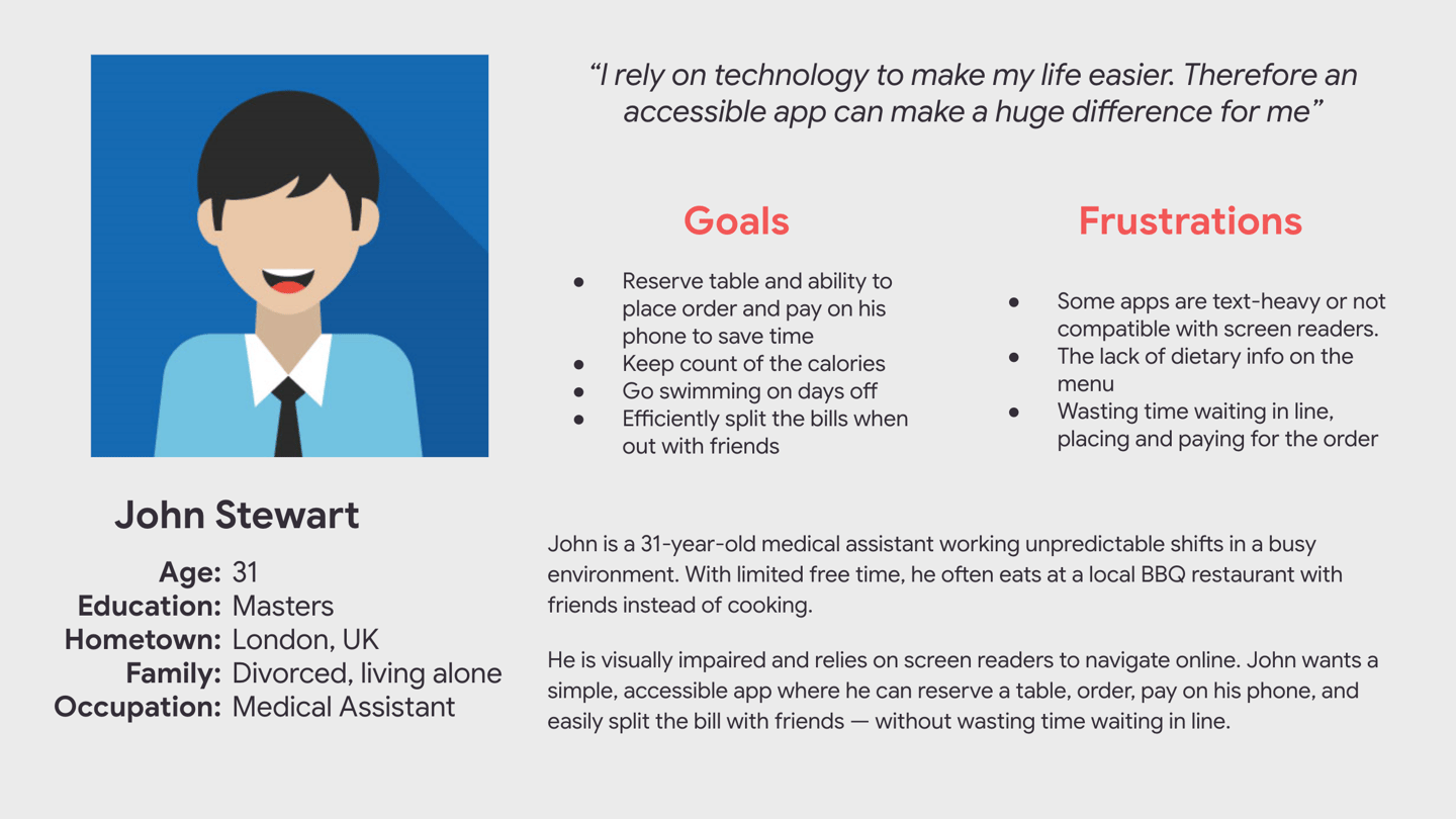
John - Visually Impaired
Needs a smooth, fast ordering flow including table booking feature that is compatible with screen readers to remain independent.
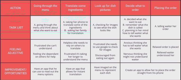
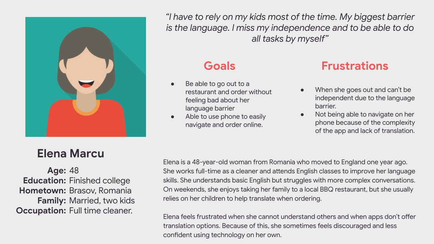
Elena - Non-Native & Low Tech Confidence
Needs a simple, clearly structured app with translation and visual guidance.
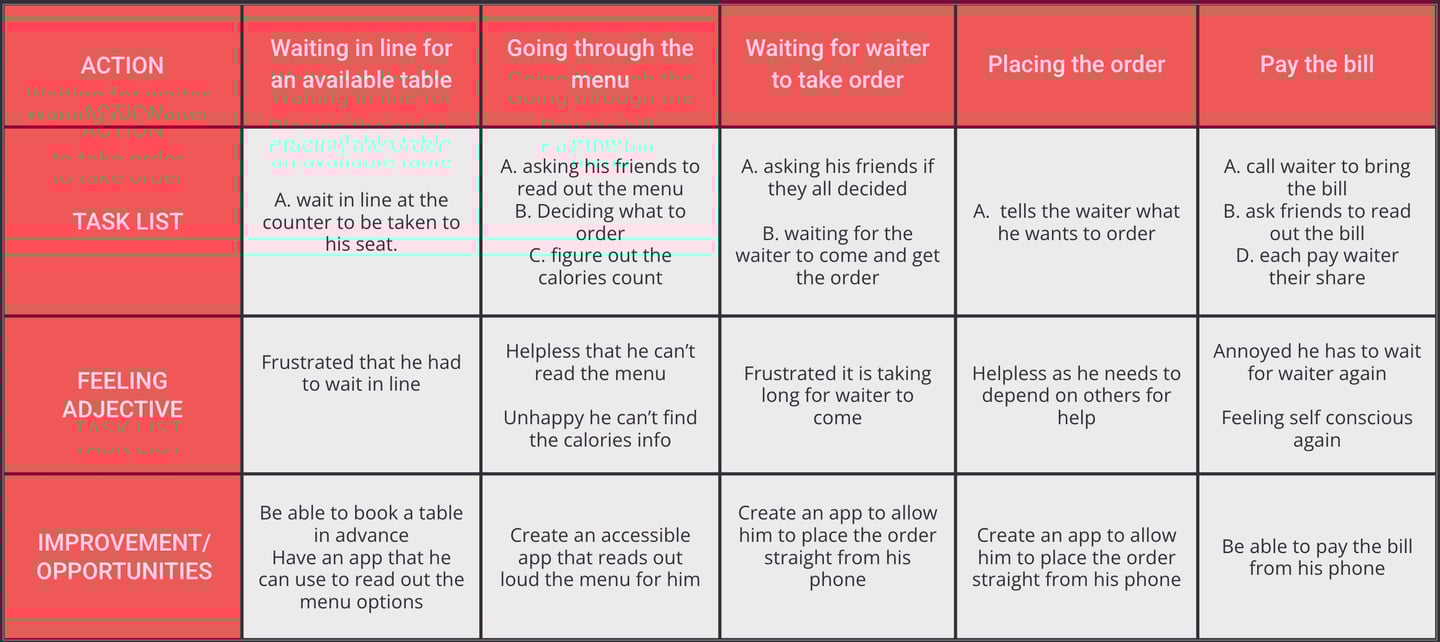

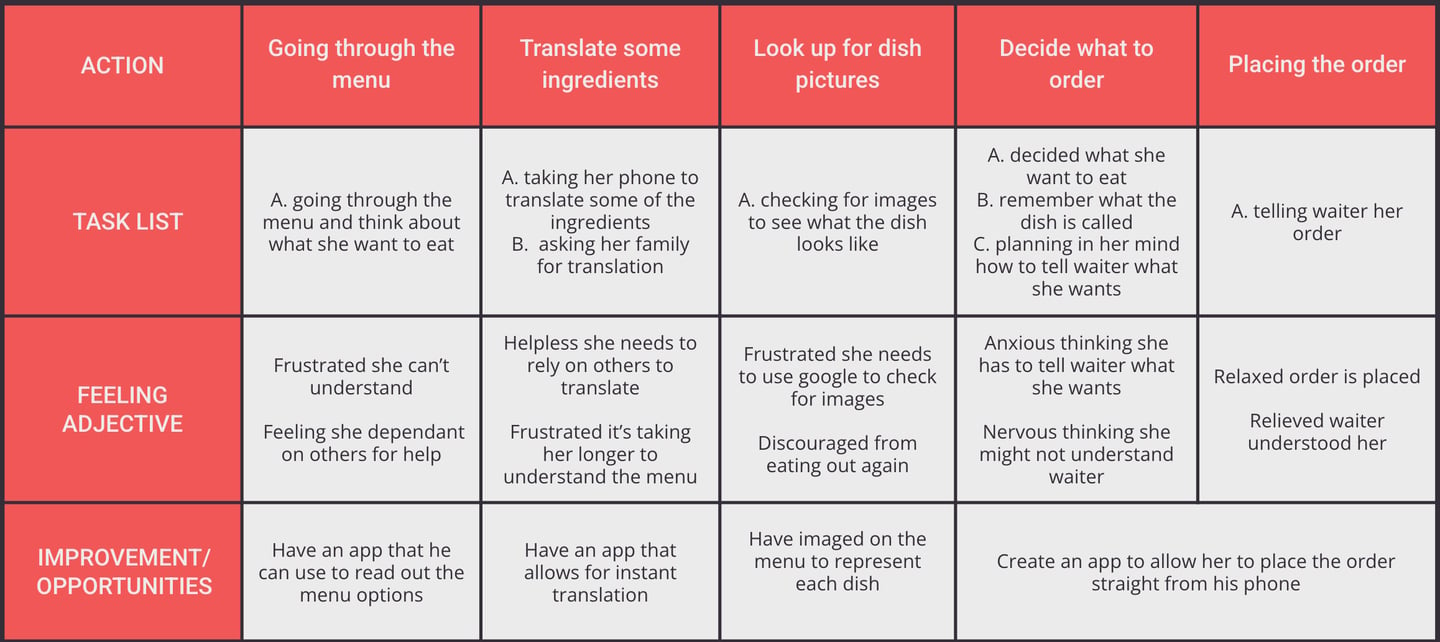
User journey maps
Market research
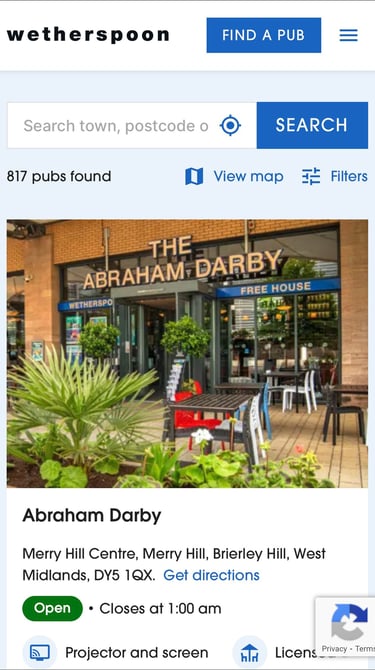
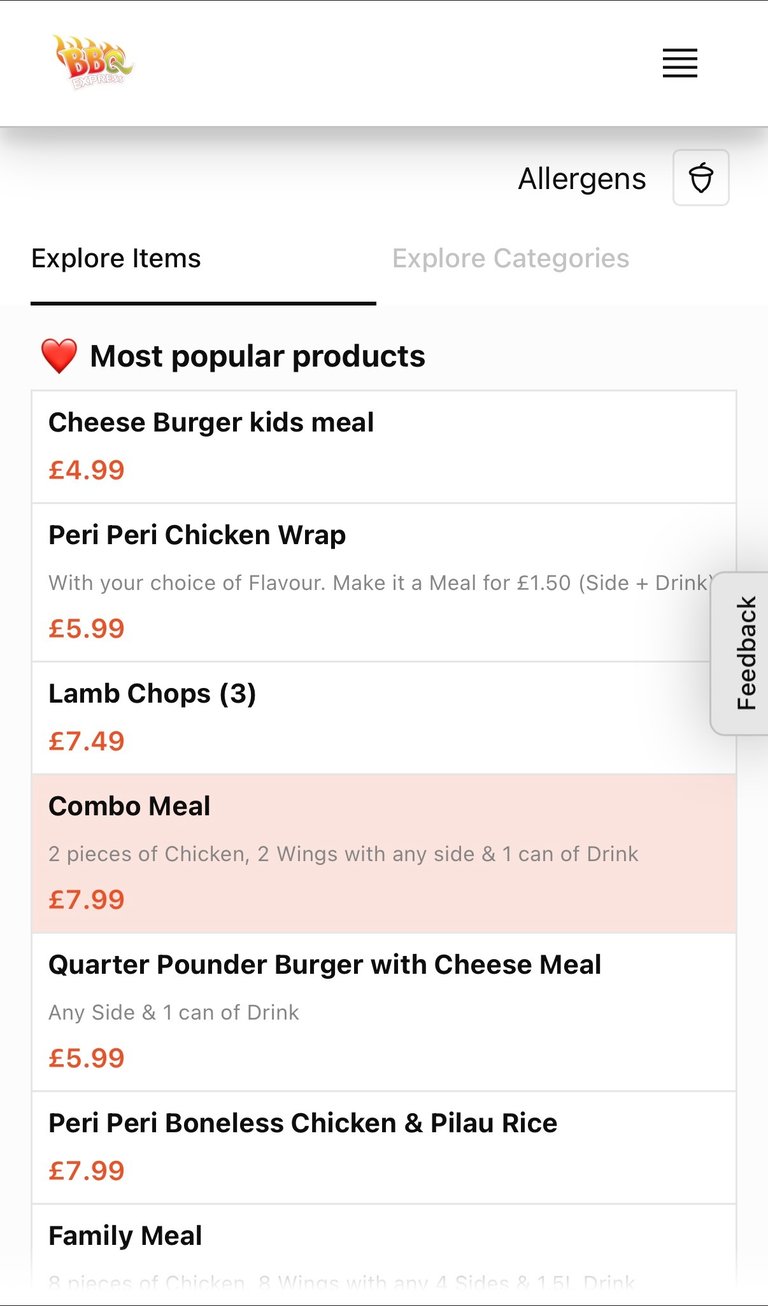
Following user research, I conducted a competitive audit, on four different restaurants, to identify systemic gaps preventing users from ordering independently — particularly those with accessibility needs or language barriers.
Evaluation criteria included:
Table-side ordering & payment
Accessibility (screen reader optimisation, alt text)
Language flexibility
Reservation management
Simplicity of checkout
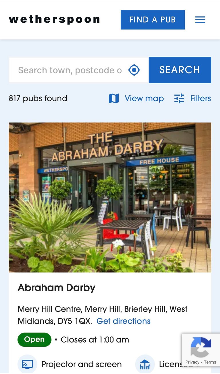
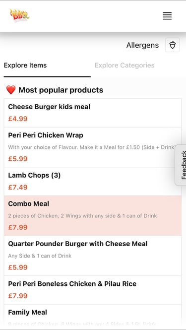
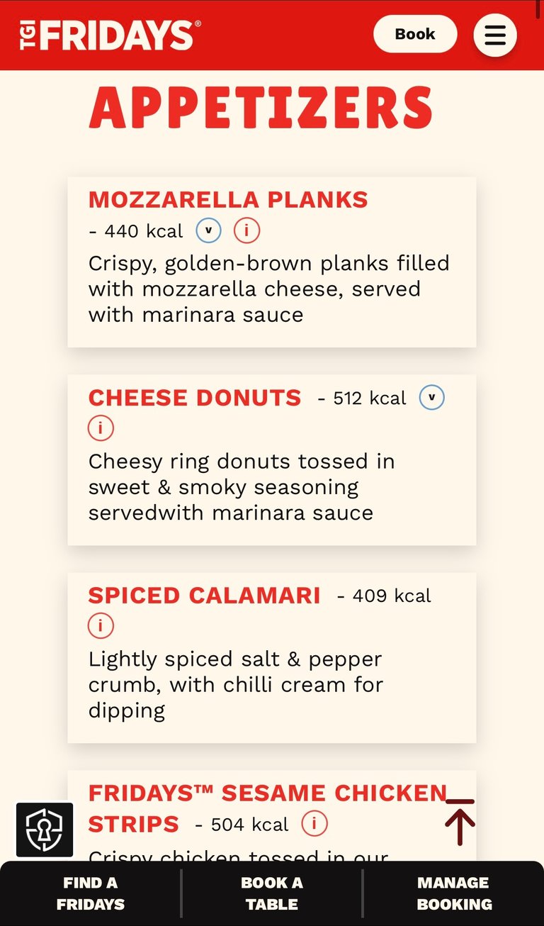
Key Insights
While some competitors offer strong functionality (e.g.Wetherspoon’s in-app ordering) and others excel in brand experience (e.g.TGI Fridays), none fully integrate:
Reservation, ordering, and payment into a unified flow
Accessibility-first design as a visible priority
Audio-enabled support beyond default device tools
Prominent language-switching functionality
Most platforms optimise for efficiency or marketing appeal — but not inclusive independence.
Accessibility is treated as secondary rather than foundational.
How might I design an inclusive ordering experience that allows any user — regardless of ability, language, or tech confidence — to make a reservation, order and pay independently, quickly, and confidently?
Goal statement
Design a seamless, accessibility-first dining experience that enables users — regardless of ability, language, or technical confidence — to browse, order, and pay independently.
Core user problem
Busy diners need a way to independently manage seating, ordering, and payment because manual queue systems and staff-dependent processes create unnecessary delays, accessibility barriers, and frustrations.


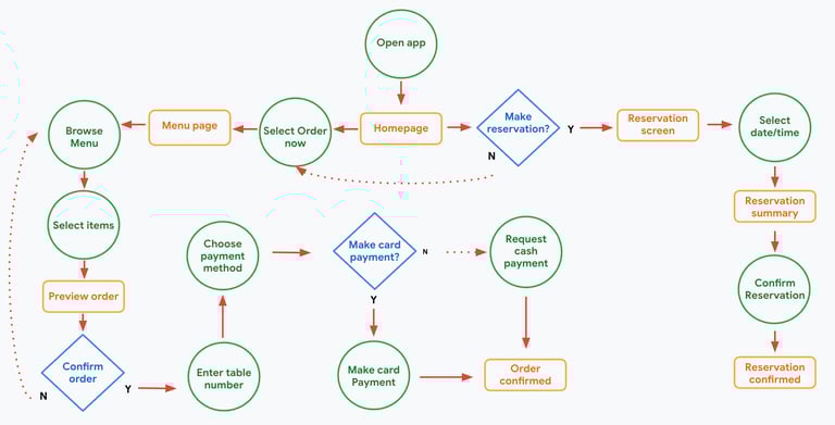
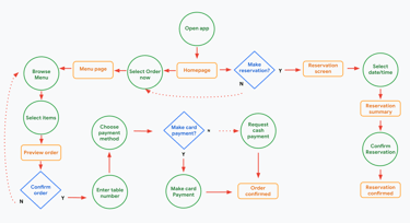
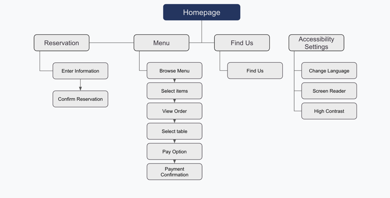

User flow & Information architecture
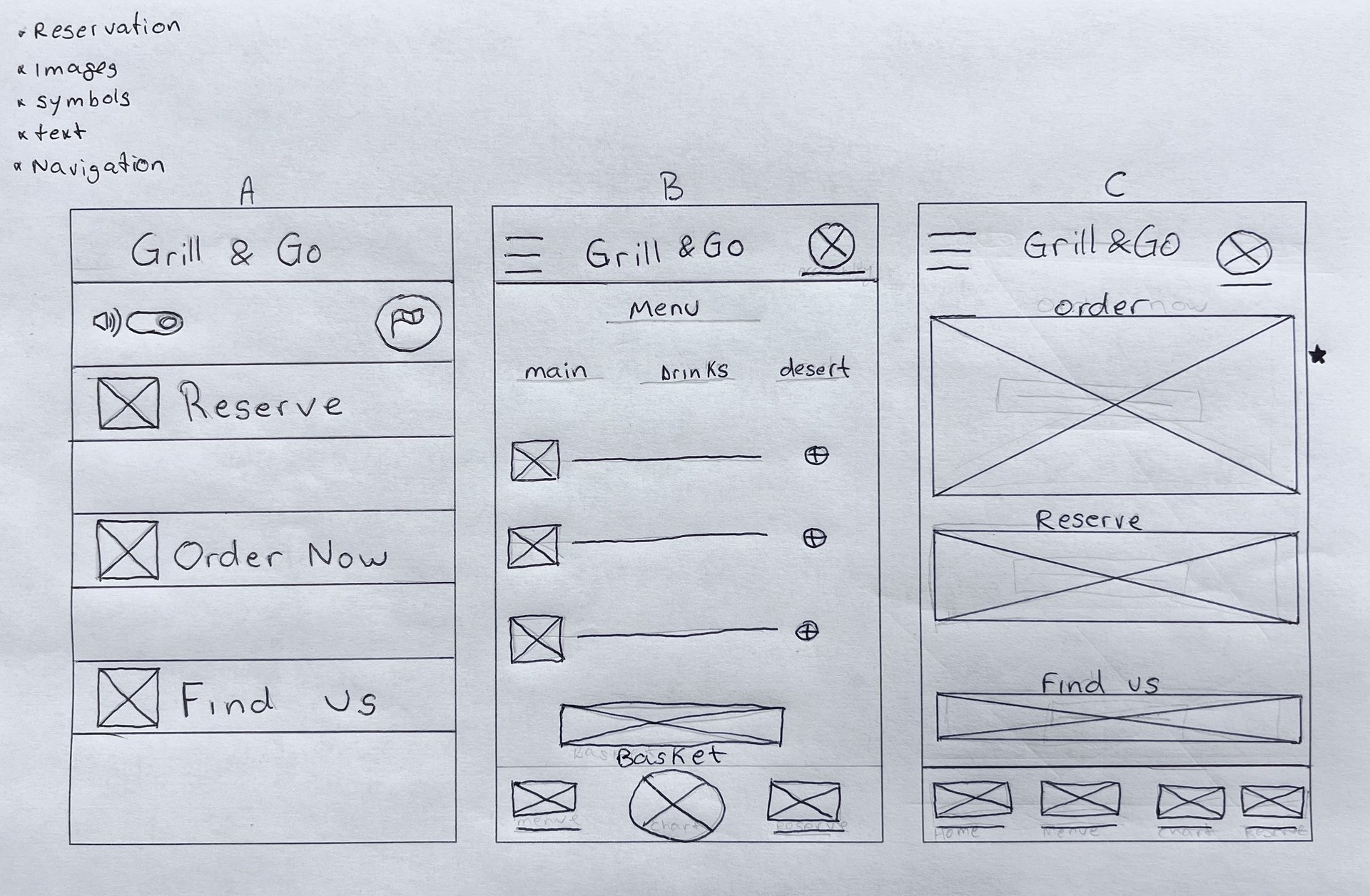
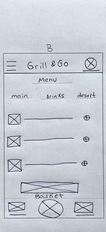
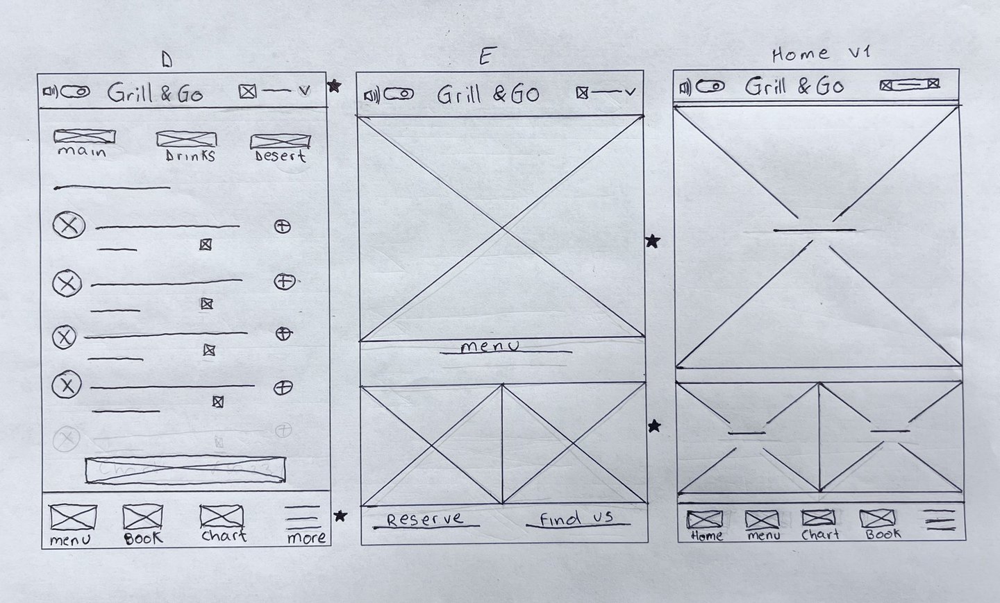
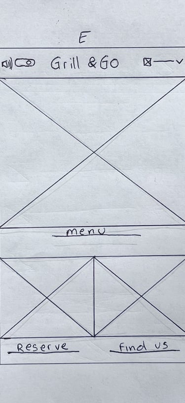
Wireframes & Lo-fi Prototype
Usability Testing
To validate the accessibility and usability of the solution, I conducted moderated usability testing focused on core task completion.


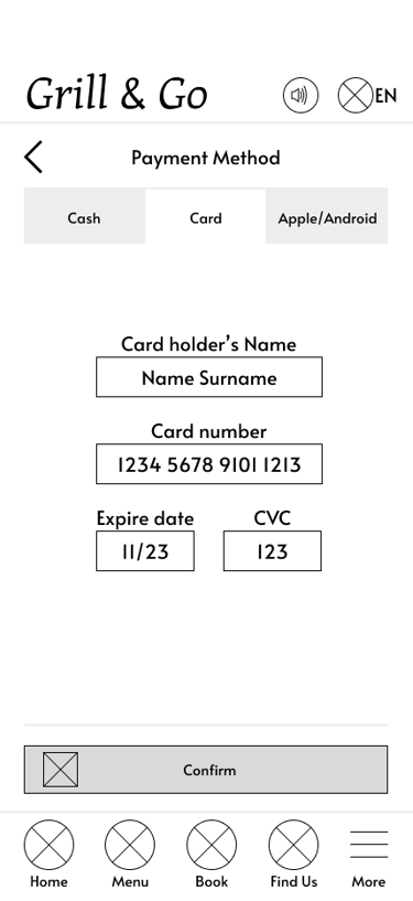
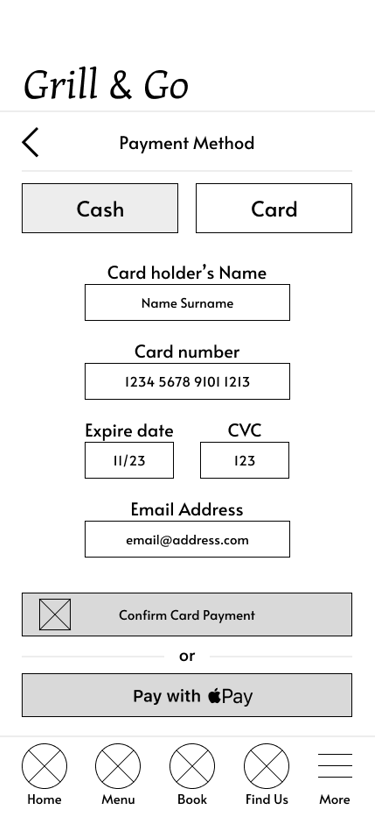
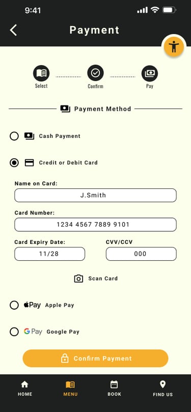
5 out of 5 participants had trouble locating the payment method buttons at the top of the screen. This indicates a critical usability issue, as all users struggled with this key function.
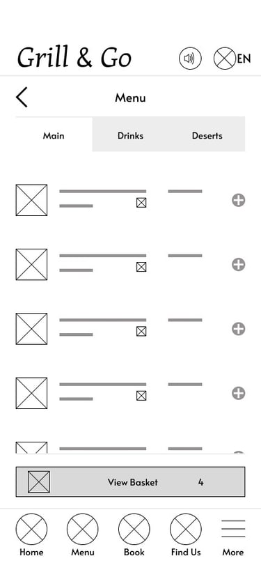
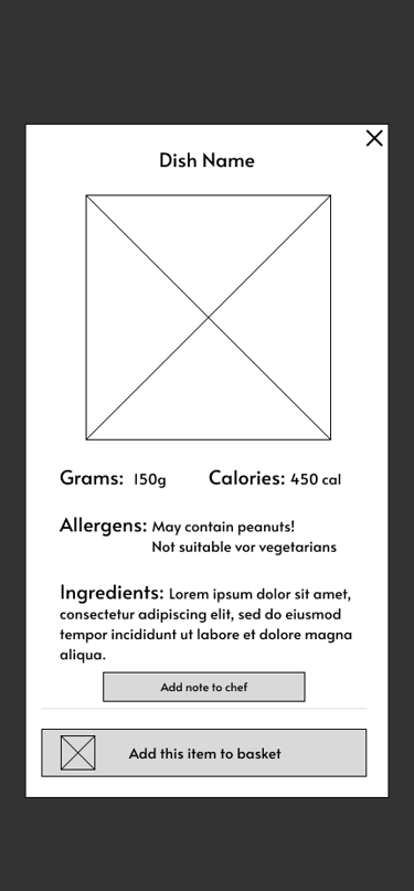
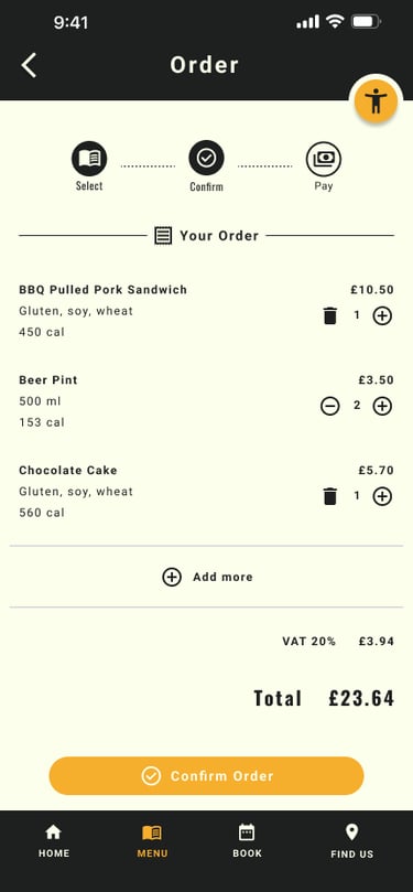
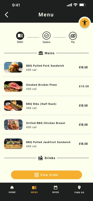
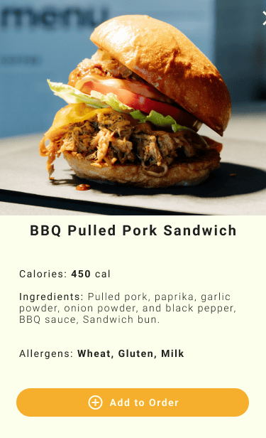
5 out of 5 participants wanted detailed information about each dish, including weight in grams, calories, and ingredients.
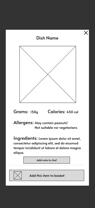
3 out of 5 participants - had issues adding items to the basket. - The “Add to Basket” function is unclear to many users, which may lead to frustration or abandoned actions.
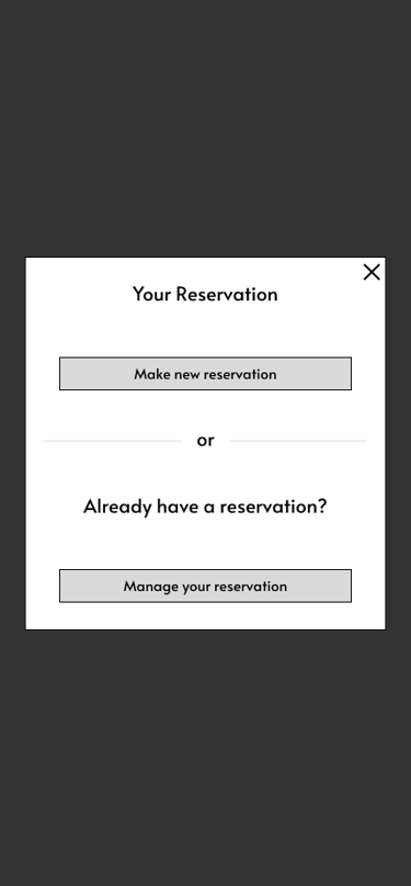
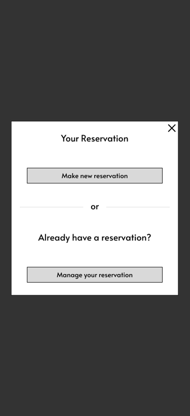
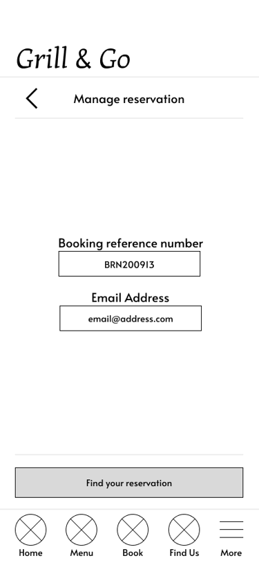
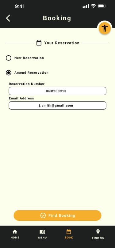
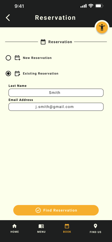
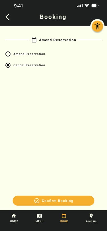
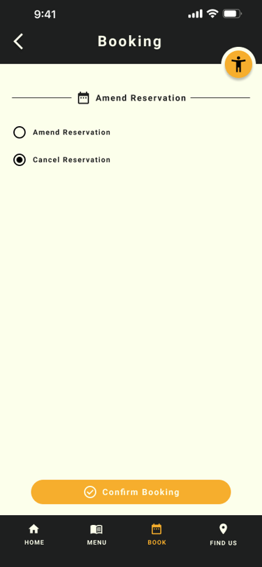
2 out of 5 participants - wanted the ability to manage their bookings, such as cancelling or modifying reservations.
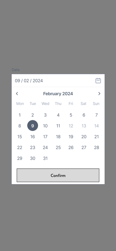
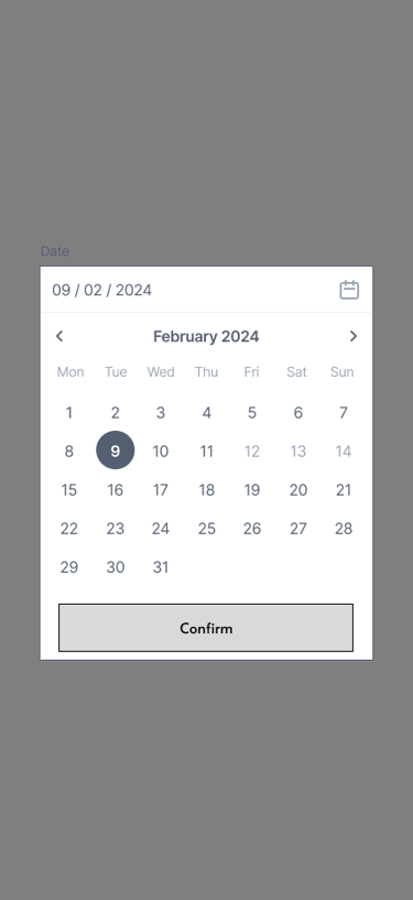
2 out of 5 participants requested a calendar view to better visualize available dates and improve clarity for the users, enhancing the booking experience.
Before
After

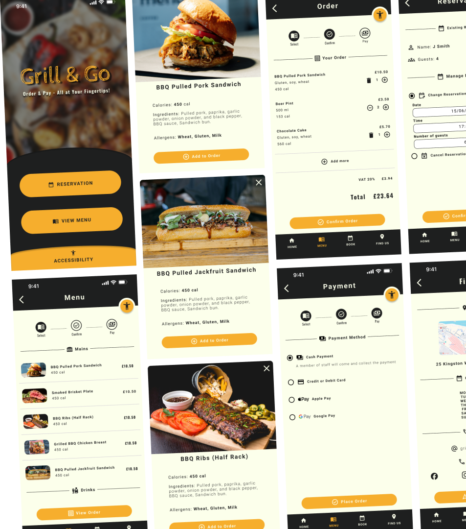
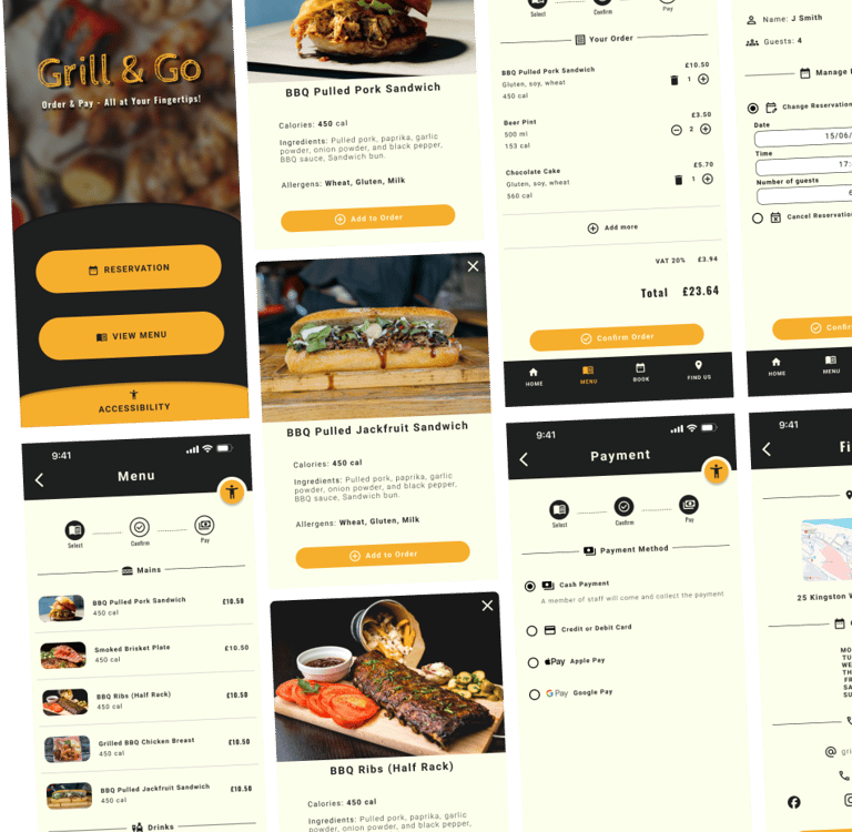
Adding Items to Basket
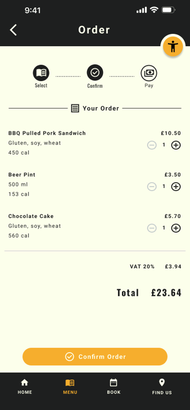
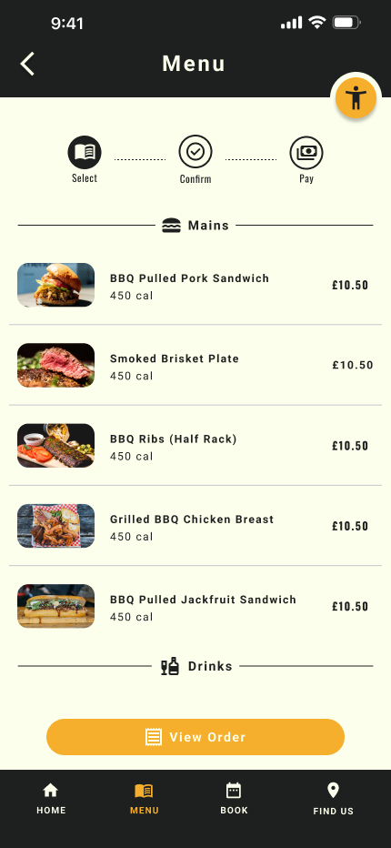
To address the issue users were having with the add to basket buttons - I've redesigned the menu by introducing individual dish cards. This also addresses the issues of missing dietary information.
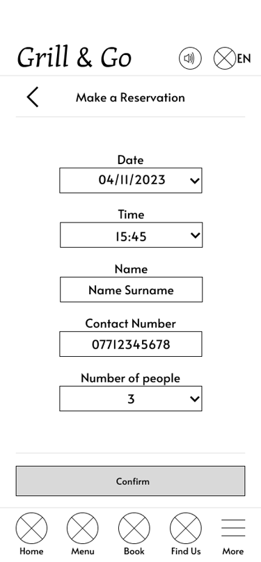
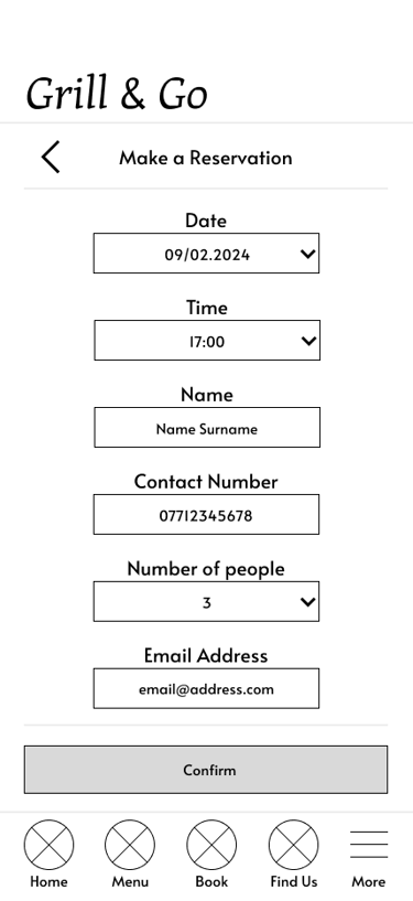
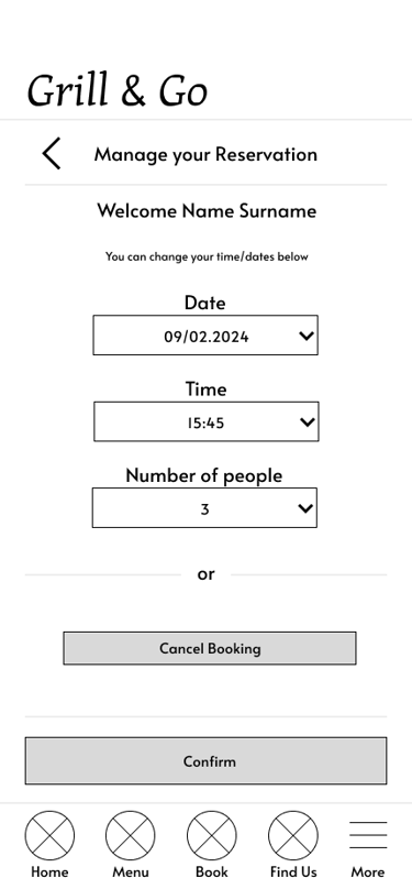
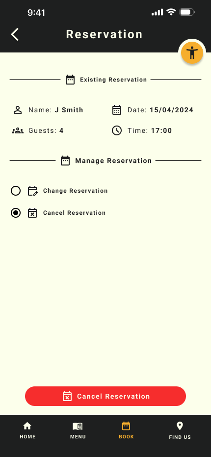
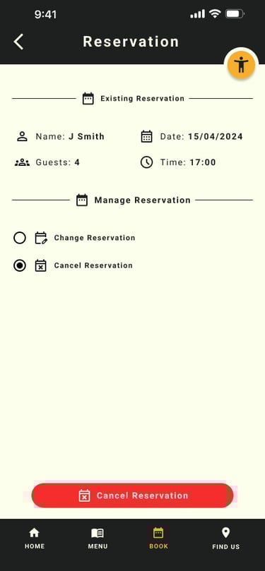
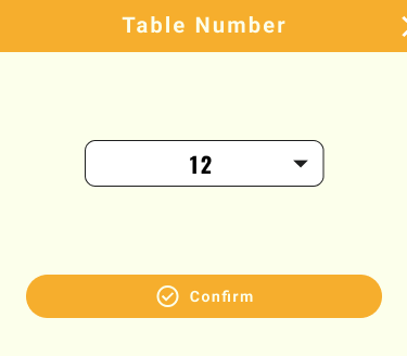
Reservation Page
Created a calendar view for when users selects the date as it helps visualise avaliability and help with planning as users now has access to a calendar
Designed a reservation management where users can make a new reservation, ammend or cancel an existing one - This give users a more convenient way of managin the reservation which will reduce further frustration should they need to change date or cancell.
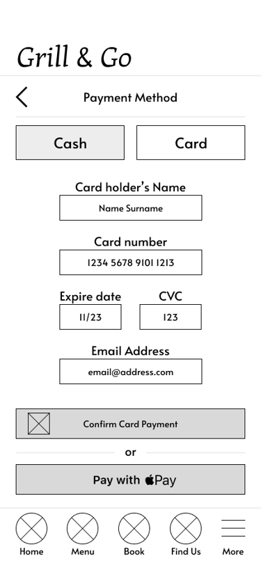
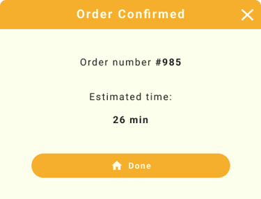
Choosing Payment Methods
To address the issue where users were missing the different payment methids - I've lowered the payment options buttons and increase the size for better visibility

Before
After
Before
After
Hi-fi prototype


Before
After
Before
After
Before
After
Before
After
To address the issue users were having with the add to basket buttons - I've redesigned the menu by introducing individual dish cards. This also addresses the issues of missing dietary information.
To address the issue users were having with the add to basket buttons - I've redesigned the menu by introducing individual dish cards. This also addresses the issues of missing dietary information.
To address the issue users were having with the add to basket buttons - I've redesigned the menu by introducing individual dish cards. This also addresses the issues of missing dietary information.
To address the issue users were having with the add to basket buttons - I've redesigned the menu by introducing individual dish cards. This also addresses the issues of missing dietary information.
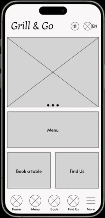
Mockup & Final Prototype


Impact
After usability validation:
100% task completion rate
Users described the app as simple, intuitive, and easy to use
All participants were able to order and pay independently
Reduced confusion and navigation errors
Increased confidence for non-tech-savvy users
Behavioural Outcomes
Faster decision making (visual menu + nutrition info)
Reduced dependency on staff
Lower cognitive load during checkout
Improved accessibility confidence
Key Learning
Accessibility must be foundational, not added later
Iteration dramatically improves usability
Simplicity beats feature overload
Diverse testing leads to stronger solutions
Clear language is critical for usability
Next Steps
Expand usability testing across broader demographics
Further optimise for low-tech users
Introduce smart recommendations / repeat orders
Develop responsive web experience
Enhance accessibility automation
Let's Connect
If you’d like to collaborate or learn more:
Email: alstcouk@gmail.com
Phone: 07714 309280
LinkedIn: linkedin.com/in/alin-stanciu
Grill & Go - Mobile app
Menu and payment app for a BBQ Restaurant
Role: Lead UX Designer, UX Researcher, Interaction & Visual Designer
Designed a unified reservation, ordering, and payment experience for a busy BBQ restaurant to reduce waiting time, improve accessibility, and streamline operations.
The Challenge
Ordering food in restaurants seems simple — until barriers appear.
During early discovery, I identified a critical gap: many users struggle to order independently due to accessibility limitations, language barriers, and complex ordering systems. These issues create frustration, increase dependency on staff, and slow down the dining experience.
The vision
Create a fully accessible, simple, and intuitive mobile ordering experience that:
Removes communication barriers
Supports accessibility needs from the start
Reduces waiting time and friction
Enables independent ordering and payment
Works for all ages, abilities, and tech levels